UI Files
All GUI elements in Unigine are generated on the fly from UI files, which are in the XML format. These files describe containers and widgets provided by Unigine. Each of them is described by an XML tag in the UI file.
UI File Syntax#
As a correct XML file, a UI file must start with a standard declaration. The second required element is a root tag ui. This root element can contain zero or more other elements (tags) specifying the interface.
<?xml version="1.0" encoding="utf-8"?>
<ui version="1.0">
</ui>
If a UI file is not syntactically correct, Unigine will log the error to the console and the main log file.
Not all available GUI elements can be defined using XML. Some of them — like manipulators and specialized dialogs and sprites - are set up only via scripting:
Attributes#
Almost all of the UI file tags have attributes, and it is good to know the following general rules:
- All dimensions provided as attribute values are in pixels.
- File names are relative to the root data directory.
- Colors are in the Web format, that is, #RRGGBB, or in the #RRGGBBAA format. Here RR, GG, BB, and AA correspond to a hexadecimal color component value—red, green, blue, and alpha, respectively; values range from 00 to FF.
- Boolean values can be set in different forms. For FALSE use: 0, false, no. For TRUE use: 1, true, yes.
<sprite align="overlap,top,right" pos_x="10" pos_y="-42" texture="data/core/gui/unigine.png"/>Comments#
You can use standard XML comments syntax. Comment blocks will be skipped during processing of a UI file. An example comment:
<!--
This section will be omitted
-->
Common Attributes#
All GUI elements—both containers and widgets —can have the following attributes.
name#
A unique name of the widget. If the export flag is set to yes, the widget will be referred to in scripts by this name. The name may contain a namespace specification and/or an array index.
<!-- The following widget will be accessible via scripts as foo::bar -->
<button name="foo::bar" export="yes"/>
<!-- This widget will be accessible via scripts as fooArray[2] -->
<button name="fooArray[2]" export="yes"/>next#
A name of a widget that receives the focus next, if the user presses the TAB key. If this attribute is omitted, the widget that immediately follows the current one will receive the focus.
<!-- Custom focus order: button_0 -> button_2 -> button_1 -->
<button name="button_0" next="button_2"/>
<button name="button_1" next="button_0"/>
<button name="button_2" next="button_1"/>align#
A set of alignment flags for the widget. Flags are separated by commas. Available flags are:
- center
Centers the widget in both dimensions in the available space.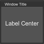 Source code (XML)
<window name="Test::window" width="150" height="150" export="1" sizeable="1"> <text>Window Title</text> <label align="center"> <text size="20">Label Center</text> </label> </window> - left
Aligns the widget to the left side.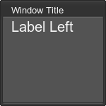 Source code (XML)
<label align="left"> <text size="20">Label Left</text> </label> - right
Aligns the widget to the right side.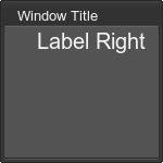 Source code (XML)
<label align="right"> <text size="20">Label Right</text> </label> - top
Aligns the widget to the top.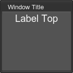 Source code (XML)
<label align="top"> <text size="20">Label Top</text> </label> - bottom
Aligns the widget to the bottom.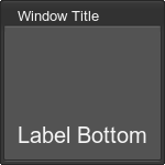 Source code (XML)
<label align="bottom"> <text size="20">Label Bottom</text> </label> - expand
Justifies the text in the available space.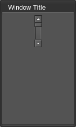
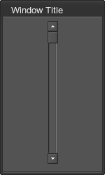 Source code (XML)
<vscroll name="Test::vscroll_0" export="1" align="expand"/> <vscroll name="Test::vscroll_1" export="1"/> - overlap
Places the widget over the contents of the parent container.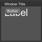 Source code (XML)
<label align="left"> <text size="35">Label</text> </label> <button name="Test::button" export="1" align="overlap"> <text>Button</text> </button> - background
Places the widget underneath other widgets in the same container. Use this flag together with overlap one. - fixed
Places the widget in focus on the background or on the foreground (depending on where it was created). This flag is valid only if overlap flag is also set. Non-fixed overlapping windows can pop over the fixed ones, while the latter cannot do it.
enabled#
A flag that specifies whether the widget is enabled. An enabled widget receives keyboard and mouse events; a disabled widget does not. Some widgets display themselves differently when they are disabled (usually they are dimmed). If a container is disabled, its content is also disabled. Acceptable values:
- 0 or no
The widget is disabled. - 1 or yes
The widget is enabled.
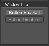
<button name="Test::button" export="1"  enabled="1">
	<text size="15">Button Enabled</text>
</button>
<button name="Test::disabled_button" export="1" enabled="0">
	<text size="15">Button Disabled</text>
</button>hidden#
A flag that specifies whether the widget is hidden or not. When a widget is hidden, it is not rendered, and other widgets in the same container are re-arranged. Acceptable values:
- 0 or no
The widget renders normally. - 1 or yes
The widget is hidden.
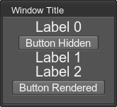
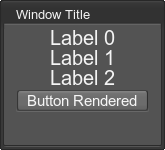
<label>
	<text size="20" rich="1">Label 0</text>
</label>
<button name="Test::button" export="1"  hidden="1">
	<text size="15">Button Hidden</text>
</button>
<label>
	<text size="20" rich="1">Label 1</text>
</label>
<label>
	<text size="20" rich="1">Label 2</text>
</label>
<button name="Test::disabled_button" export="1" hidden="0">
	<text size="15">Button Rendered</text>
</button>pos_x#
The x -coordinate of the widget relative to the top left corner of its parent container. It takes effect only if the overlap alignment flag is set.
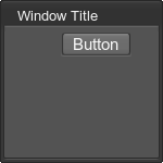
<button name="Test::button" export="1" align="overlap" pos_x="40">
	<text size="15">Button</text>
<button>pos_y#
The y -coordinate of the widget relative to the top left corner its parent container (Y-values increase top down - higher value results in lower position). It takes effect only if the overlap alignment flag is set.
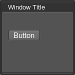
<button name="Test::button" export="1" align="overlap" pos_y="30">
	<text size="15">Button</text>
<button>width#
Width of a widget.
height#
Height of a widget.
export#
A flag that specifies whether to export a reference to the widget or not. If yes, the widget will be exported with the name set using the name attribute. The default value is 0. Acceptable values:
- 0 or no (default)
The widget will not be exported. - 1 or yes
The widget will be exported.
reference#
Text Tags and Formatting#
There are tags that used for outputting and formatting text.
text#
Many widgets and containers have a text child, which provides some formatting capabilities.
Attributes:
- rich
Whether the text inside the tag is formatted or plain. The default is 0 (boolean), which corresponds to plain. - face
Path to a TrueType font file, which will be used by default.Source code (XML)<text face="fontb.ttf">Text</text> - size
Default font size (pixels).Source code (XML)<text size="20">Text</text> - color
Default font color.Source code (XML)<text color="#ff0000">Text</text> - permanent
Whether a text color should be changed when the widget is disabled (non active), transparent (enabled option on non-active window), or widget loses focus. The default is 0 (not to change the color).For example, when the window is disabled, the second label doesn't change its color.
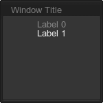 Source code (XML)
<window name="Test::window" width="150" height="150" export="1" sizeable="1" enabled="0"> <text>Window Title</text> <label><text permanent="0">Label 0</text></label> <label><text permanent="0">Label 1</text></label> </window> - outline
Whether the text should be outlined. The default is 0 (boolean), which corresponds to no outlining.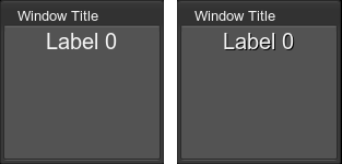
The outlined text is represented on the right picture.
Source code (XML)<label><text size="20" outline="1">Label 0</text></label> - wrap
Whether the text should be wrapped around, if it does not fit width of the container. The default is 0 (boolean), which corresponds to no wrapping.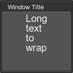 Source code (XML)
<label><text size="20" wrap="1">Long text to wrap</text></label> - hspacing
Horizontal spacing (in pixels) between letters. The default is 0.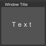 Source code (XML)
<label align="center"><text size="20" hspacing="8">Text</text></label> - vspacing
Vertical spacing (in pixels) between text lines. The default is 0.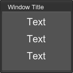 Source code (XML)
<label align="center"><text size="20" vspacing="15" rich="1">Text<br/>Text<br/>Text</text></label> - hoffset
Horizontal text offset (in pixels). The default is 0 (no offset).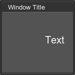 Source code (XML)
<label align="center"><text size="20" hoffset="35">Text</text></label> - voffset
Vertical text offset (in pixels). The default is 0 (no offset).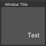 Source code (XML)
<label align="center"><text size="20" hoffset="35" voffset="35">Text</text></label> - translate
Whether the text can be translated. The default is 1 (boolean), which means that the text depends on the selected language.
font#

Enables to change font characteristics of widgets and containers. This tag can be applied to a group of widgets or containers. The list of attributes is the same as for the text tag except thetranslate attribute. This attribute should be applied to a text or a label individually (see the example below).
Also the font size can be calculated relatively to its current size. For example:
<font size="+10">Larger</font>
<font size="-4">Smaller</font>
<font size="%200">Same or smaller</font>
The following example demonstrates how to apply the font to the group of widgets:
<vbox>
	<font size="13" rich="1" outline="1">
		<align align="left">
			<label face="fontb.ttf" size="15" color="#ff9900">Labels</label>
			<label translate="1">Label <b>1</b></label><!-- this label can be translated -->
			<label>Label <b>2</b></label>
			<label><font size="17">Label of bigger size</font></label>
			<label>Label <b>4</b></label>
		</align>
	</font>
</vbox>

Font tags can be nested. However, the following restrictions exist:
- If the nested font tag is applied to a widget or a container, font properties are not inherited.
Source code (XML)In the result, Label 2 will not be outlined:
<font size="13" rich="1" outline="1">
	<align align="left">
		<label face="fontb.ttf" size="15" color="#ff9900">Labels</label>
		<label>Label <b>1</b></label>
		<font size="20" rich="1">
			<label>Label <b>2</b></label>
		</font>
	</align>
</font>
- If the font tag is applied to the rich text inside a widget or a container, font properties are inherited.
NoticeIn this case, the list of font attributes will differ. See the details below.Source code (XML)In the result, the font characteristics will be inherited:
<font size="13" rich="1" outline="1">
	<align align="left">
		<label>Label <b>1</b></label>
		<label><font size="17">Label of bigger size</font></label>
	</align>
</font>
align#
Unlike the align attribute of the text tag, thealign tag can be applied to a group of widgets.
Attributes:
- align
Acceptable values are center, left, right.
For example:
<align align="right">
	<label><text>Title1</text></label>
	<edittext name="Test::edittext_1" export="1" width="100" height="100">
		<text>EditLine1</text>
	</edittext>
	<label><text>Title2</text></label>
	<edittext name="Test::edittext_2" export="1" width="100" height="100">
		<text>EditLine2</text>
	</edittext>
</align>

Rich Text Formatting#
If the rich attribute of the text or font tag is equal to 1, yes or true, the following tags and entities can be used to format the text inside them:
br#
Line break.
<text rich="1">Text 1 <br/>
Text 2<br>Text 3</text>p#
Paragraph. Acceptable attributes: align with values center, left, right, justify.
center#
Centered alignment. Equivalent to <p align="center">text</p>.
font#
Font characteristics. This tag enables to change default font characteristics. It differs from the font tag, which is described above.
- face
Path to a TrueType font file. - size
Font size (pixels). - color
Font color. - outline
Whether the text should be outlined. The default is 0 (boolean), which corresponds to no outlining. - hspacing
Horizontal spacing (in pixels) between letters. The default is 0. - vspacing
Vertical spacing (in pixels) between text lines. The default is 0. - spacing
Overall spacing (in pixels) between text lines. The default is 0.
The following example demonstrates how to change the default text characteristics:
<label>
	<text rich="1">
		<font size="20" color="#ff0000">A big red text</font> and a text of the default style.<br/>
		<font face="fontb.ttf" size="20">You can also change the font face.</font><br/>
		<font color="#00ff00">Here is a green text with a <font size="10">small tail.</font></font>
	</text>
</label>

sub#
Subscript text.

<text size="20" rich="1">Text <sub>Subscript text</sub></text>sup#
Superscript text.

<text size="20" rich="1">Text <sup>Superscript text</sup></text>i#
Italic font.
b#
Bold font.
bi#
Bold Italic font.
table#
Table. Acceptable attributes:
- color
Border color. - space
Overall spacing (pixels). - space_x
Horizontal spacing (pixels). Sets a space between table content and the left and right table borders. - space_y
Vertical spacing (pixels). Sets a space between table content and the upper and bottom table borders. - offset_x
Horizontal offset of the table. - offset_y
Vertical offset of the table.
Children:
- tr
Table row. Multiple are allowed. Acceptable attribute:- height
Sets a height of the row.
Children:
- td
Table column. Multiple are allowed. Acceptable attribute:- width
Sets a width of the column.
- width
- height

<text size="20" rich="1">
	<table space="10" color="#ffffff">
		<tr height="45">
			<td>Row 0 Column 0</td>
			<td>Row 0 Column 1</td>
		</tr>
		<tr height="45">
			<td>Row 1 Column 0</td>
			<td>Row 1 Column 1</td>
		</tr>
	</table>
</text>xy#
Sets the fixed coordinates for the text. Acceptable attributes:
- x
X coordinate of the text. - y
Y coordinate of the text. - x=%<value> or x="%<value>"
X coordinate of the text relative to the current text container. - y=%<value> or y="%<value>"
Y coordinate of the text relative to the current text container. - dx
Text offset along the X axis. - dy
Text offset along the Y axis.
<text size="20" rich="1"><xy x="12" y="24"/>Text</text>Values of the x and y attributes that are prepended % set the position of the text relative to the size of the current text container in percents. For example:
- x=%0 y=%0 values correspond to the top left corner of the text container.
- x=%0 y=%100 values correspond to the bottom left corner of the text container.

For example:
<text rich="1" size="20">
	This is a <xy x="%50" y="%100"/>long text
</text>

To adjust the text position, use the dx and dy attributes.
image#
Inserts an image. Acceptable attributes:
- src
Path to an image. - color
Image color multiplier. - x
X coordinate of the image. - y
Y coordinate of the image. - x=%<value> or x="%<value>"
X coordinate of the image relative to the current text container. - y=%<value> or y="%<value>"
Y coordinate of the image relative to the current text container. - dx
Image offset along the X axis. - dy
Image offset along the Y axis. - scale_x=%<value> or scale_x="%<value>"
Horizontal scale factor for the image size in percents relative to its current size. By default, a horizontal scale of an image is 100%. - scale_y=%<value> or scale_y="%<value>"
Vertical scale factor for the image size in percents relative to its current size. By default, a vertical scale of an image is 100%. - scale=%<value> or scale="%<value>"
Overall scale factor for the image size in percents relative to its current size. By default, a scale of an image is 100%.
Values of the x and y attributes that are prepended % set the position of the image relative to the size of the current text container in percents. For example:
- x=%0 y=%0 values correspond to the top left corner of the text container.
- x=%0 y=%100 values correspond to the bottom left corner of the text container.

For example:
<text rich="1" size="15">
	Image with a long description: <image src="brush_square.png" x="%100" y="%100"/>
</text>

To adjust the image position, use the dx and dy attributes.
To scale the image, use the scale_x
right#
Aligns the text that follows this tag to the right border of a widget.

<text rich="1">Text<right/>Text</text>>#
The > symbol.
<#
The < symbol.
&#
The & symbol.
"#
The " symbol.
'#
The ' symbol.
&#SYMBOL_DEC_CODE;#
Numeric character reference, where SYMBOL_DEC_CODE symbol's decimal code (e.g., A = 'A').
Include Tag#
This tag allows including the external *.ui file.
Attributes:
- name
Path to the *.ui file to be included.
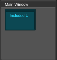
For example, you can insert one window into another as follows:
<window name="Test::window" export="1" width="356" height="356">
	<include name="test_01.ui"/>
</window><?xml version="1.0" encoding="utf-8"?>
<ui version="1.0">
<window name="Test::window_2" export="1" width="156" height="156" color="#26DEFF" align="left">
<label width="70" height="40">
<text color="#7FC9FF">Included UI</text>
</label>
</window>
</ui>This example shows the following:
Reference Tag#
This tag serves to refer to containers. The containers, which are referred by the reference tag, must have the name attribute.
Attributes:
name
A container name to which the reference is made.
Custom attribute
The name of this attribute is a part of the widget name that need to be replaced. The acceptable value of the attribute is a replacement string. This is an optional attribute.
For example, there are the vbox container, which is defined as follows:
<vbox name="Test::vbox" export="0" space="8" reference="1">
	<label><text>Label 0</text></label>
	<label><text>Label 1</text></label>
	<label><text>Label 2</text></label>
</vbox>
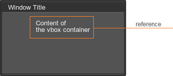
This container won't be shown in the GUI, because the reference attribute is set to1. To show the container, add a reference to it:
<window name="Test::window" export="1" width="356" height="356">
	<reference name="Test::vbox"/>
</window>
The result is the following:
If you want to use the same widget (or container) in different parts of your GUI with minimum changes, you can add a reference to it rather than duplicate. To change a child of the widget, first you should define its name attribute and set the export attribute to 1.
<vbox name="Test::vbox" reference="1">
	<label name="Test::label_N" export="1"></label>
</vbox>
Then you need to add the reference tag with the custom attribute. In the example, this attribute named label_N. The value of this attribute is a name of an object of the WidgetLabel class that is declared in the script and is subjected to change.
<window name="Test::window_0" export="1" width="250" height="150" sizeable="1" enabled="1" space_y="10">
	<text align="left">First Window</text>
	<reference name="Test::vbox" label_N="label_0"/>
</window>

<window name="Test::window_1" export="1" width="250" height="150" sizeable="1" enabled="1" space_y="10">
	<text align="left">Second Window </text>
	<reference name="Test::vbox" label_N="label_1"/>
</window>
In the script, you should declare widgets as global variables and define necessary properties for the widgets that is subjected to change. Then you need to add root widgets to be rendered via Gui::addChild(). For example:
namespace Test {

	WidgetWindow window_0;
	WidgetWindow window_1;
	WidgetLabel label_0;
	WidgetLabel label_1;
	UserInterface ui;

	void init() {
		ui = new UserInterface(engine.getGui(),"window.ui");

		label_0.setText("The first label"); // text shown in the first window
		label_1.setText("The second label"); // text shown in the second window
	}

	void show(int x,int y) {
		Gui gui = engine.getGui();
		gui.addChild(window_0); // add the first window
		window_0.setPosition(x,y);
		gui.addChild(window_1); // add the second window
		window_1.setPosition(x+100,y);
	}
}

int init() {

	Test::init();
	Test::show(50,50);

	return 1;
}
As the result, two windows with different text are shown:

Also the name of the widget or container can be defined as an array. To address to the required object, use the following:
<vbox name="Test::vbox" reference="1">
	<label name="Test::label[NUM]" export="1"></label>
</vbox>
<window name="Test::window" export="1" width="250" height="150" sizeable="1" enabled="1" space_y="10">
	<text align="left">First Window</text>
	<reference name="Test::vbox[NUM]" NUM="0"/>
</window>
In the script, you should declare an array of objects of the corresponding widget class:
WidgetLabel label[1];

label[0].setText("The first label");
The information on this page is valid for UNIGINE 2.19 SDK.